
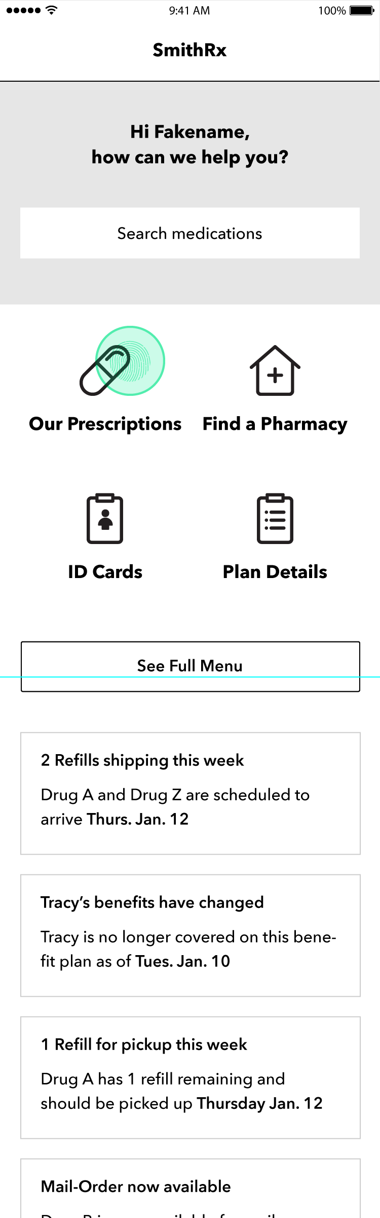
Mobile UI/UX


Navigating from Home to "Find Pharmacy"

Nearest pharmacies are shown based on location

Basic filters including in-network and Rx availability. Encouraging Mail-Order was a key business goal

User selects a pharmacy from the Map or List
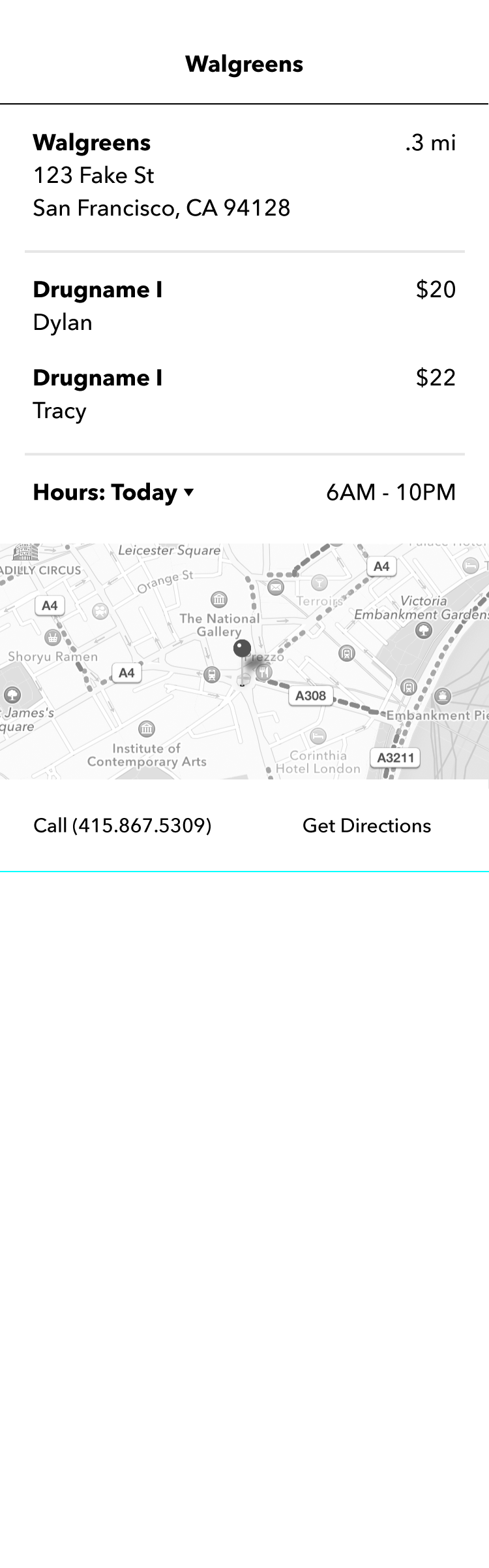
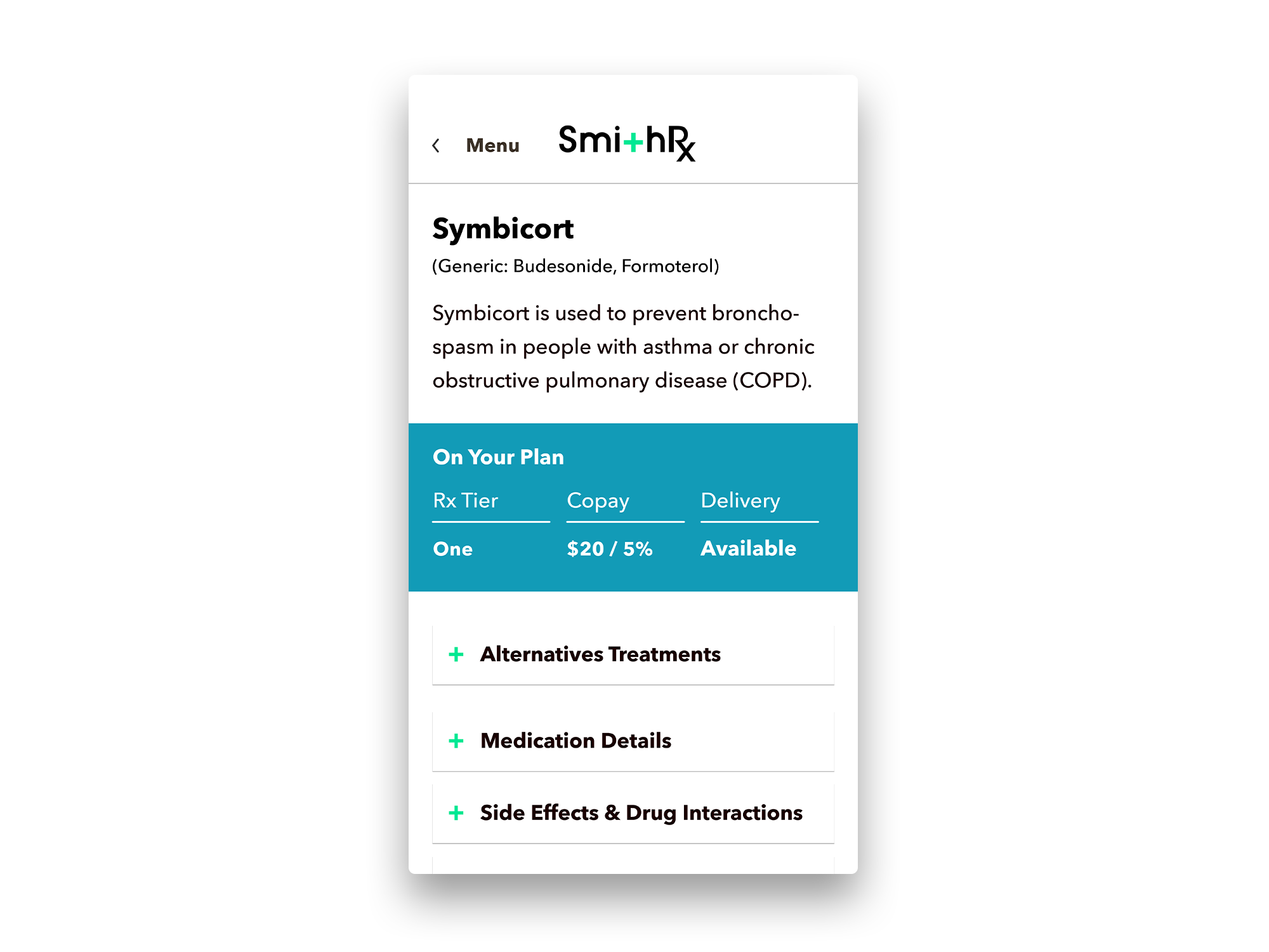
Pharmacy Details page with clear, actionable information based on user feedback

Navigating from Home to "Plan Details"

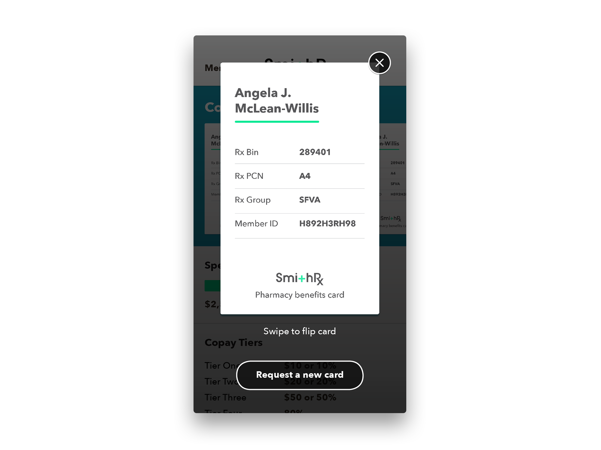
Showing Family Spend before choosing one family member from the native dropdown

Showing Individual Spend and exploring how to show how much the patient will need to spend to meet their deductible
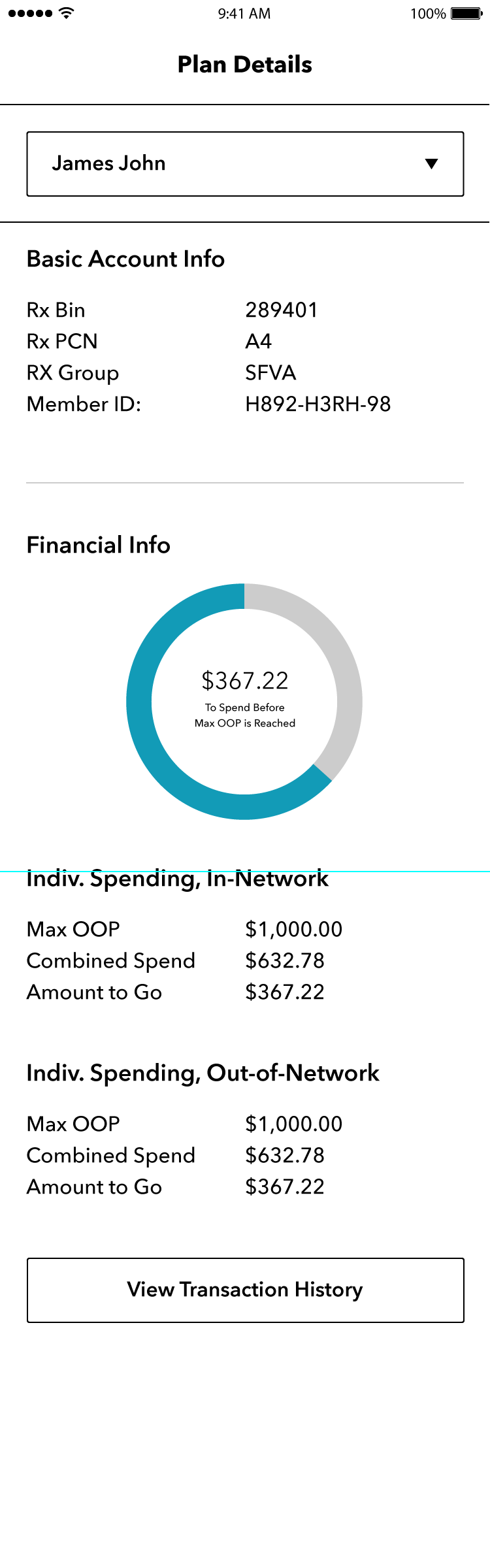
Individual Patient Info Screen A: Show spend in pie chart, list specifics
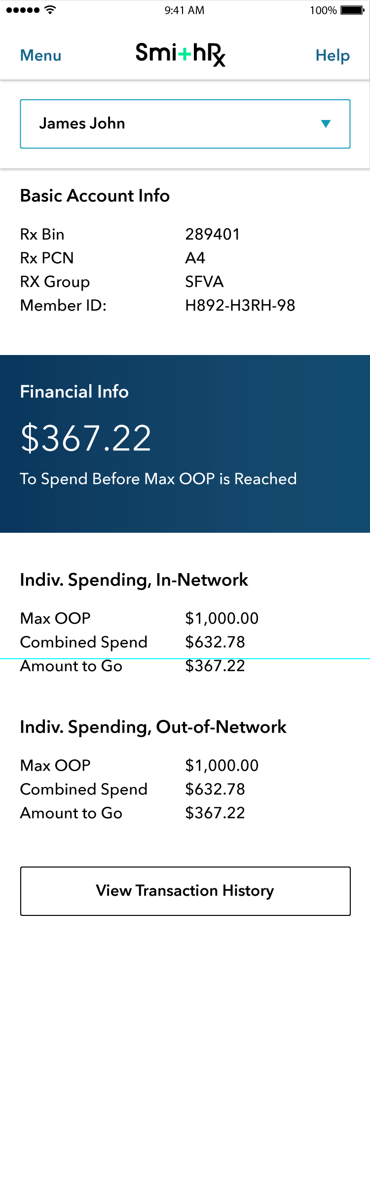
Individual Patient Info Screen B: Spend to Deductible as focal point without chart, list specifics
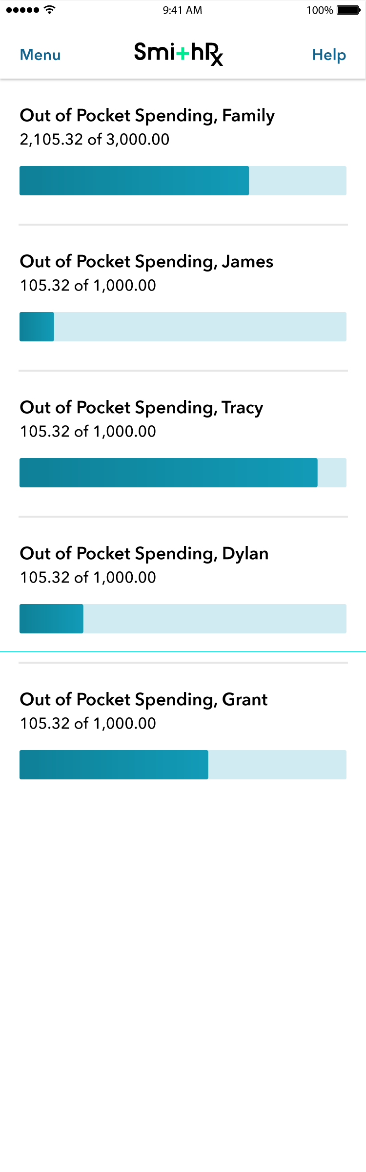
Individual Patient Info Screen C: Spend to Deductible for all patients shown in bar graph, specific amounts shown

Individual Patient Info Screen D: Spend to Deductible for all patients shown in bar graph, specific amounts available on tap
Navigating from Home to "Find Pharmacy"

Viewing All Family Members, choosing one from dropdown
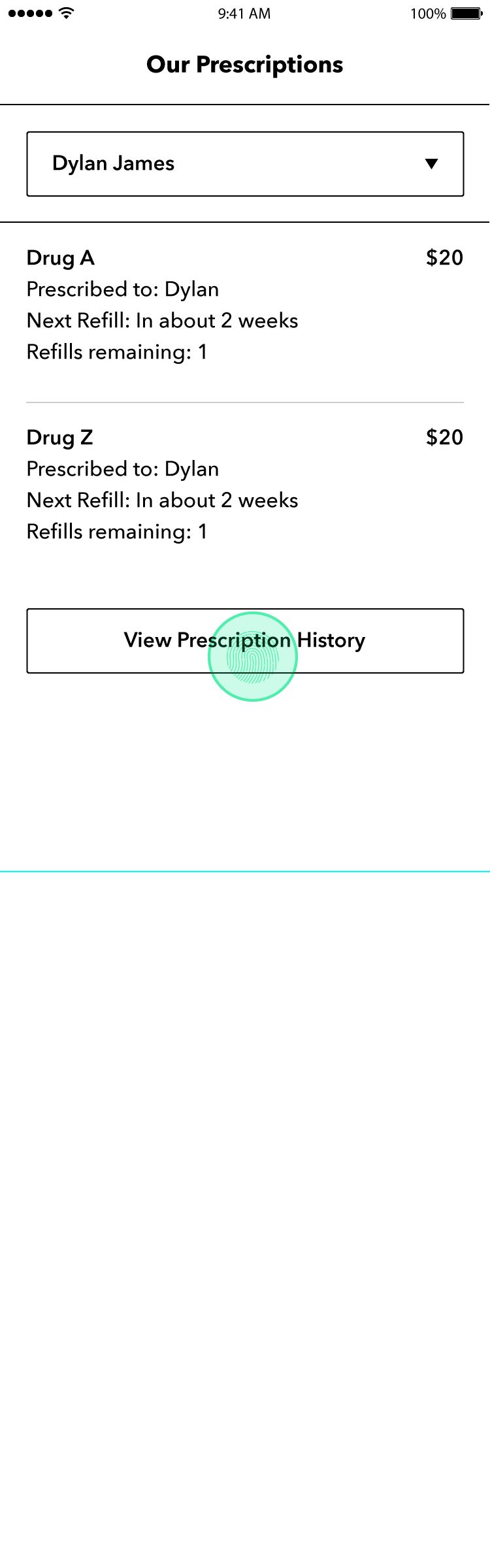
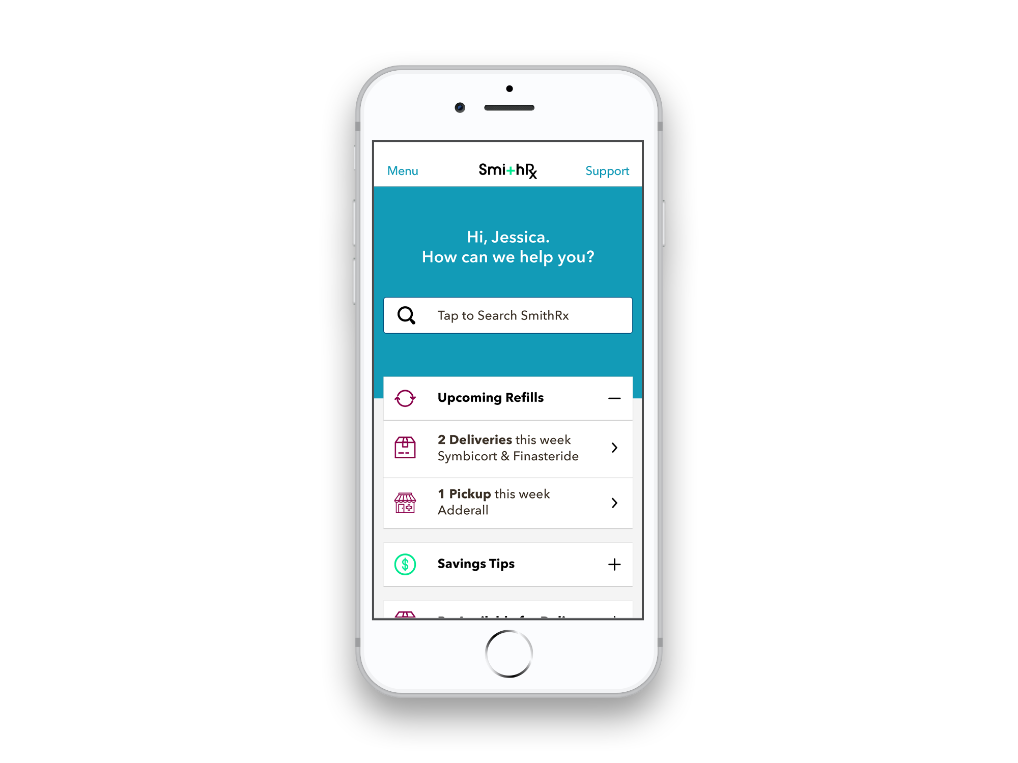
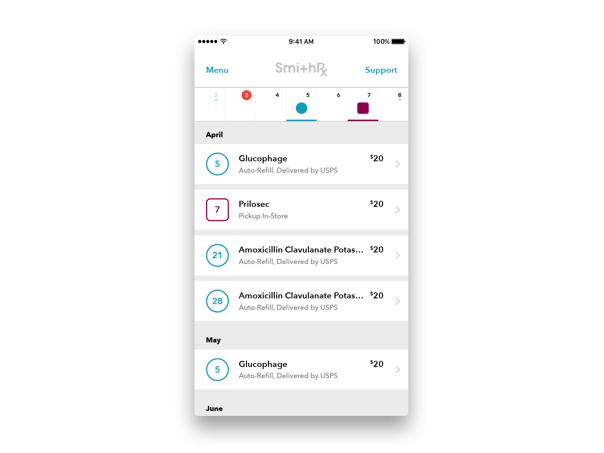
Users requested easy access to individual patient's prescription history

Viewing a patient's full prescription history to share with doctors, pharmacists, or in case of emergency
Civic Hero (2013) My first app designed from wires to final while leading a small team

Landing page with daily missions, nearby reports to confirm, and easy access to Create Report
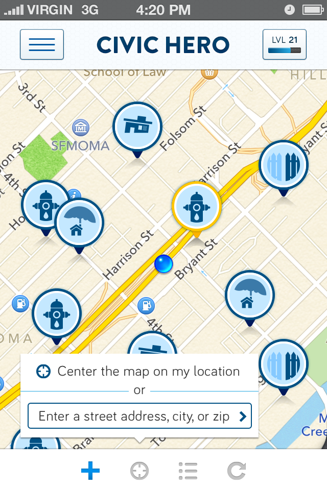
Users can explore reports via the map, change their location, view reports as a list, or refresh
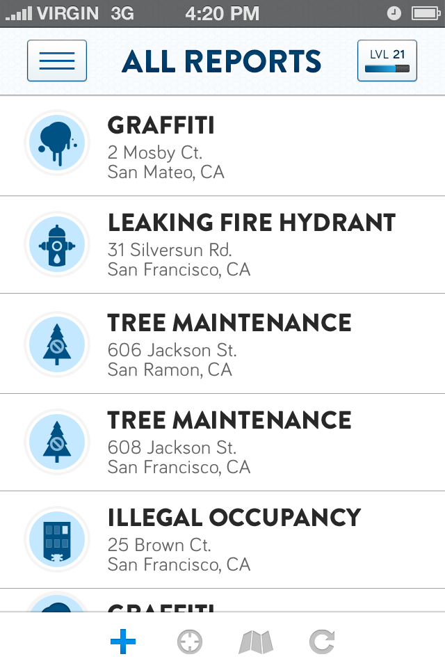
Reports shown as list. (My icon family designs have held up slightly better than the logo.)
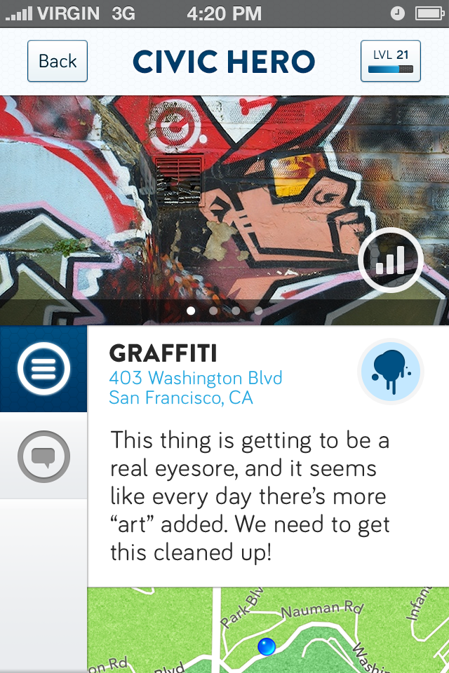
Report Landing Page with photos, description, and comments
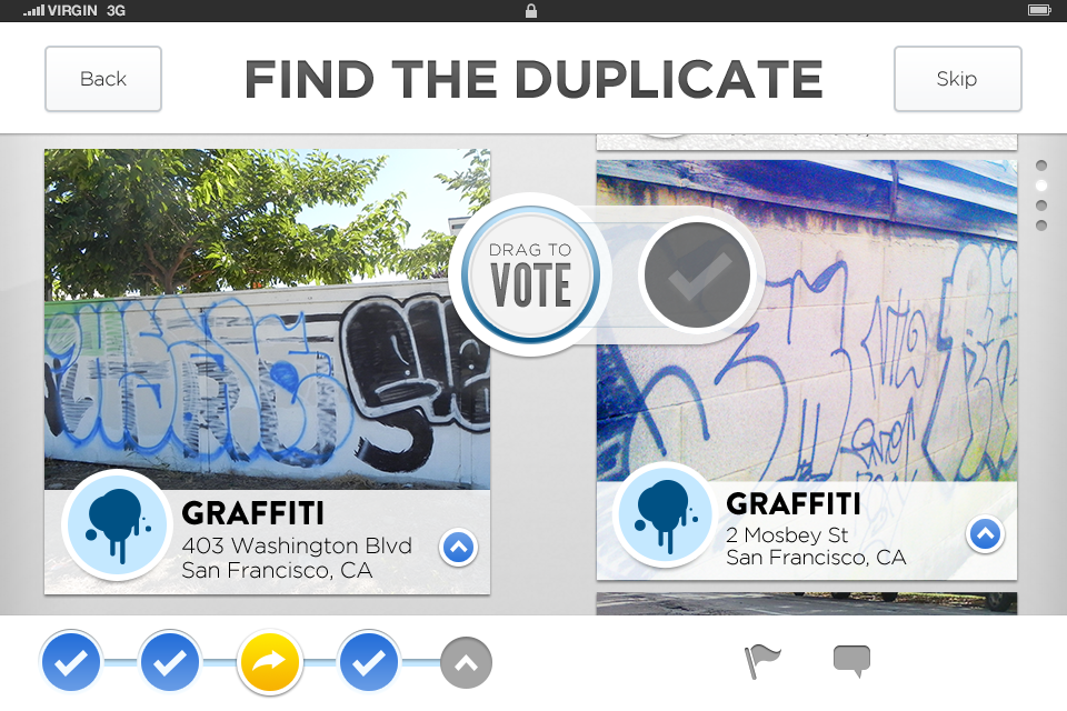
"Find the Duplicate" Mission: Users help find duplicates to increase reporting accuracy

"Which is Worse" Mission: Users choose which report they would prioritize fixing, those results are sent to the city.